


Context
Tokopedia is one of Indonesia’s largest e-commerce platforms with diverse business lines: marketplace, travel, digital goods, and investments. Later merging with Gojek under GoTo (2021) and acquired by TikTok Shop (2024). With a mission to democratize commerce, Tokopedia serves millions of users in Indonesia.
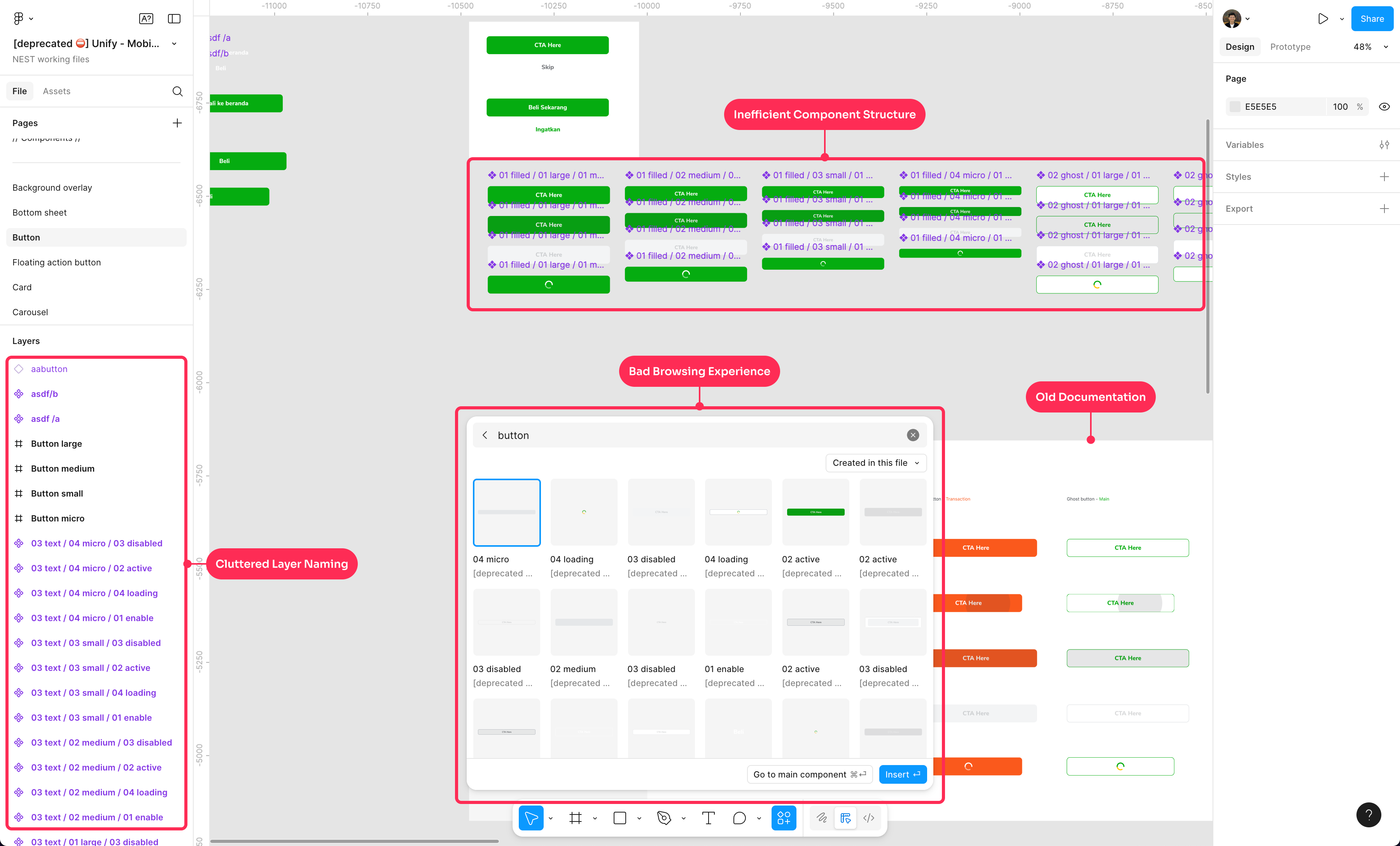
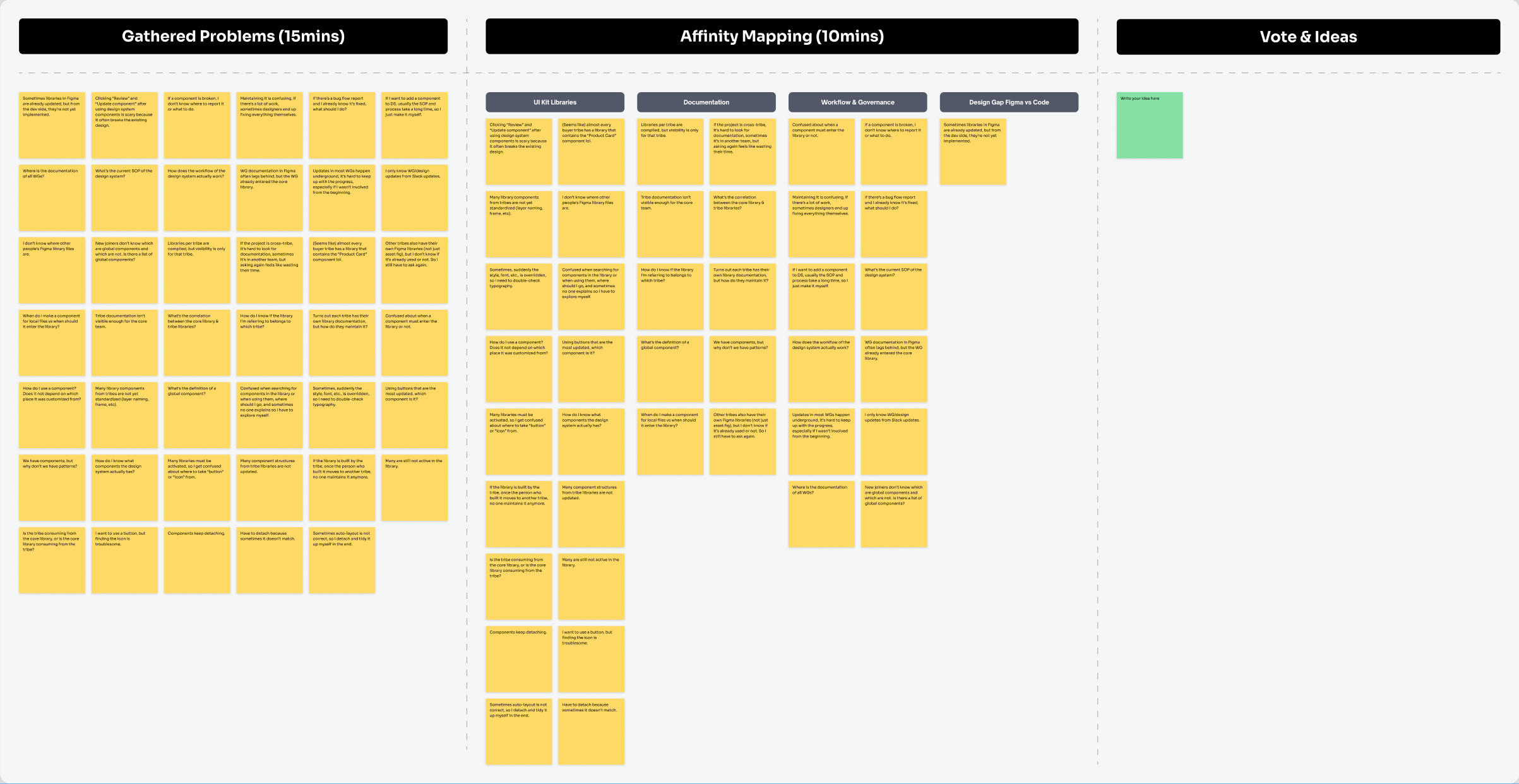
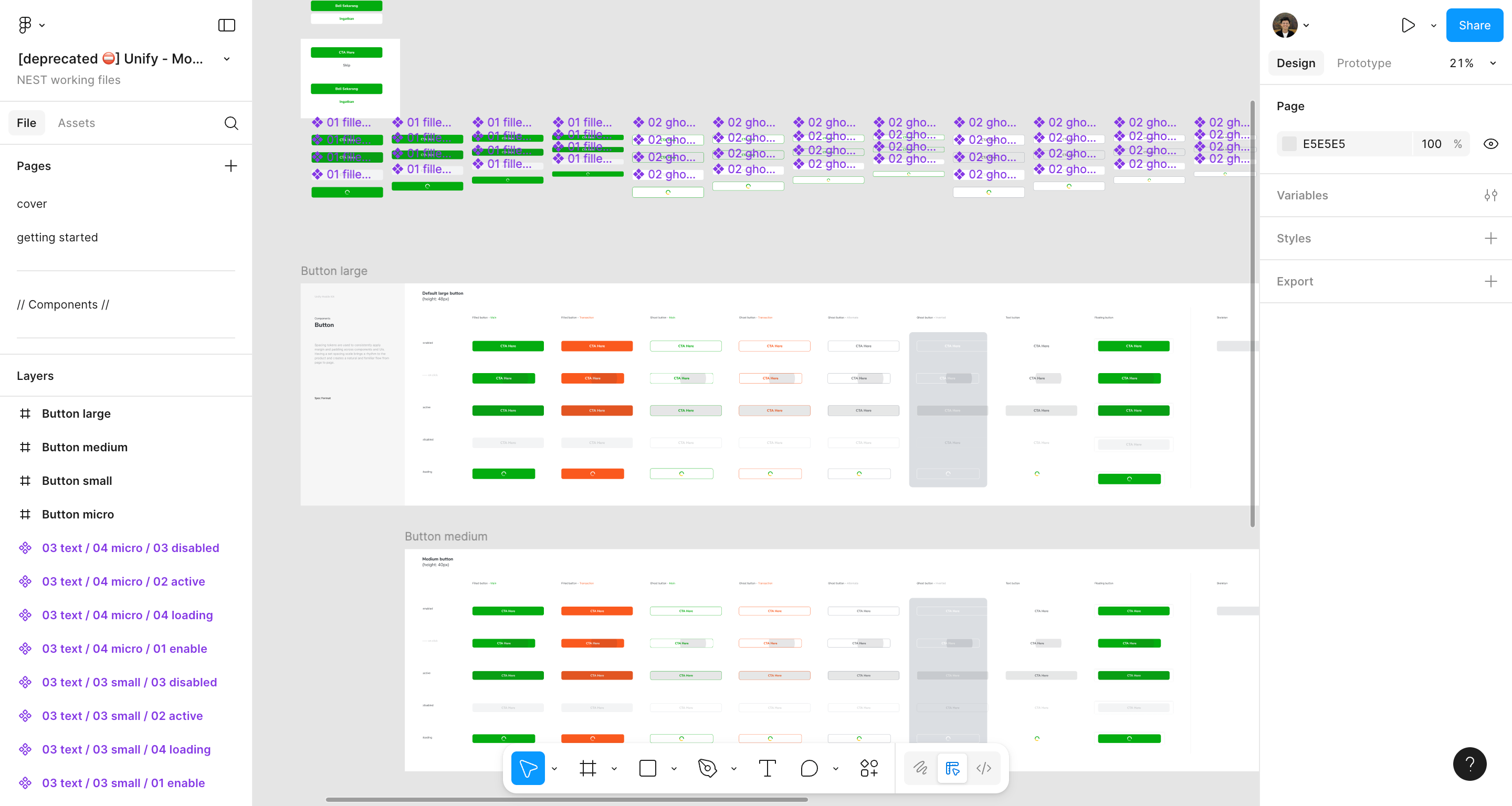
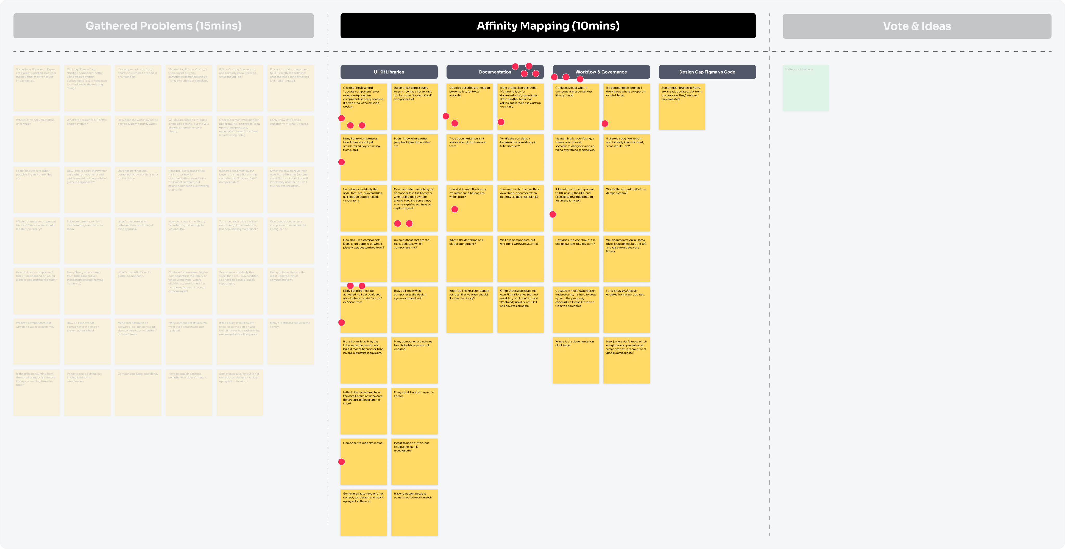
I joined Tokopedia in 2018 and contributed across multiple teams including Home, PDP, Search, Marketplace Categories, and Content. During these time, I observed how the design system, Unify, had stagnated with no initiative no improvement, even with don’t have designers in design system for ~1 year and that causing friction for both designers and engineers.