
My Contribution
I contributed to this project by leading the governance and restructuring of Tokopedia’s design system. In it’s first year , with 100+ designers and 200+ UX engineers relied on the design system, resulting in measurable improvements:

3.8M
Component Reuses

$40M+
Efficiency Value

77%
Designer Satisfaction
ABOUT THIS PROJECT
YEAR
2022
TIMELINE
6 MONTHS
ROLE
SR. INTERACTION DESIGNER
CONTRIBUTORS
UX ENGINEERS, PRINCIPAL DESIGNERS, UX DESIGNERS
Context
Tokopedia is one of Indonesia’s largest e-commerce platforms with diverse business lines: marketplace, travel, digital goods, and investments. Later merging with Gojek under GoTo (2021) and acquired by TikTok Shop (2024). With a mission to democratize commerce, Tokopedia serves millions of users in Indonesia.
I joined Tokopedia in 2018 and contributed across multiple teams including Home, PDP, Search, Marketplace Categories, and Content. During these time, I observed how the design system, Unify, had stagnated with no initiative no improvement, even don’t have designers in design system for ~1 year and that causing friction for both designers and engineers.
Problem: Outdated and Messy Governance
Tokopedia’s first design system, Unify Merah Putih : One for All , launched in 2016 with a philosophy: a single design language used across 3 platforms and 2 experience (Customer and Business experience). By 2020 it rebranded into Nest, introducing new typography, icons, colors, and motion.
However, rebranding didn’t fix the core governance issues :
- Primitive, non-scalable tokens.
- Uncontrolled component adoption.
- Poor quality UI kits without standards, leading to broken experiences.
- Lack of governance and processes, resulting in inconsistent usage.
- Slow bug resolution, frustrating both designers and engineers.
In a system where many parts depend on each other, a single small failure can trigger breakdowns everywhere else.

Therefore, these governance failures risked creating long-term inefficiency, inconsistency, and reduced trust in the system . Designers often bypassed the system, break the rules, do whatever they want to achieve their need, where that is not align with the design system value.
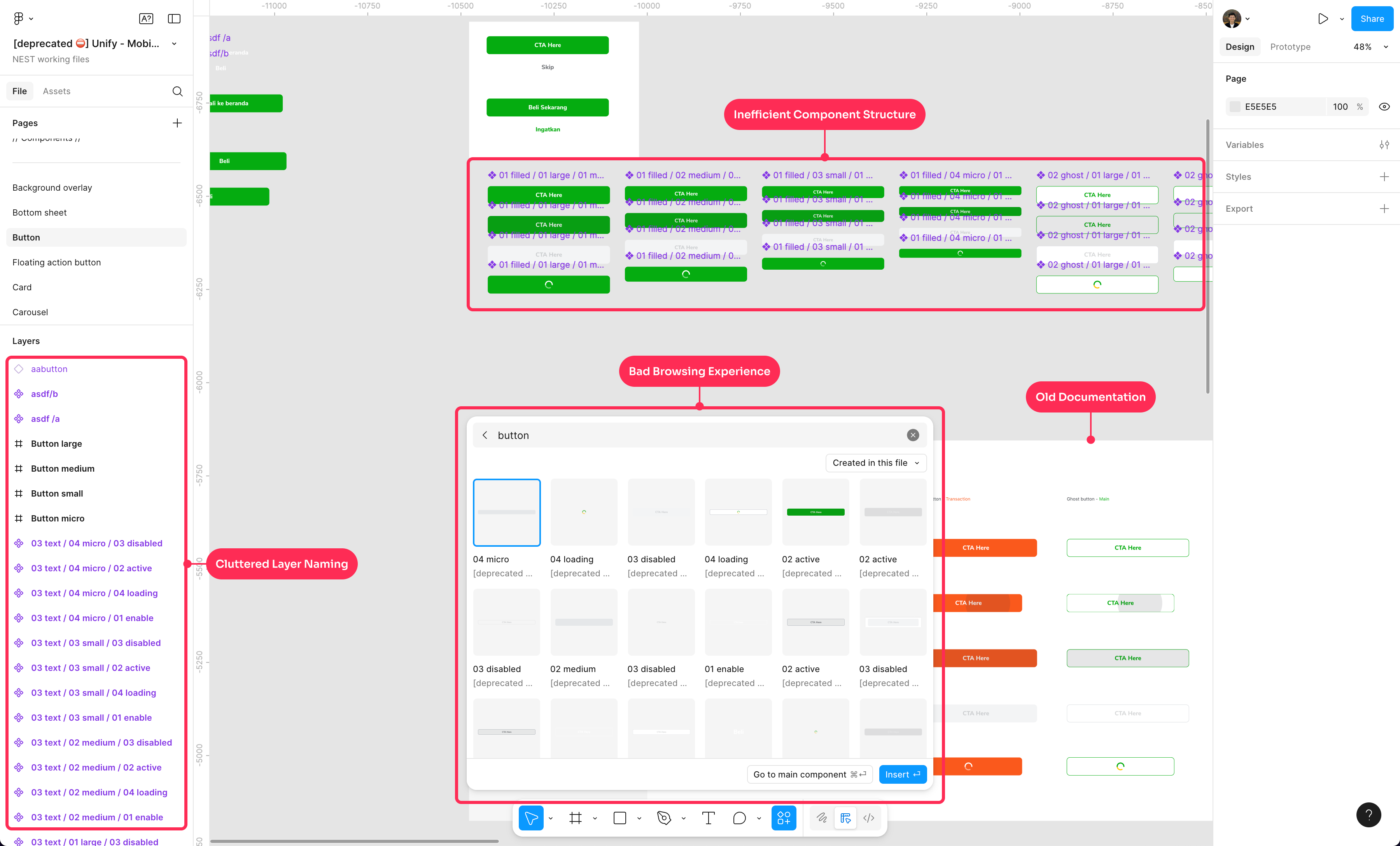
example of inefficient the figma library, affecting the browsing experience, broken component, etc.
Why this Matters
With 100+ designers and 200+ engineers building products across diverse business lines. Without a well-governed design system, scaling becomes chaotic:
- Designers waste time fixing or using components.
- Engineers face mismatches between design and code.
- Inconsistency weakens brand trust across platforms.
A strong governance model was essential to enable speed, consistency, and scale.
Success Metrics
To measure impact, I focused on 4 key areas:
- Adoption : higher usage of standardized libraries across tribes.
- Consistency : reduction in detached/duplicated components.
- Efficiency : less design-engineering misalignment.
- Satisfaction : positive feedback from designers using the system.
Design Process
As this project is our P0 roadmap in that year . With a total 1 year execution window, the priority was solving the right problems based on research and data. The process was:

1
Identify Problem
2
Design Strategy
3
Execution
Part 1 - Identify Problem
To validating my hypothesis, I divided the process into 2 steps:
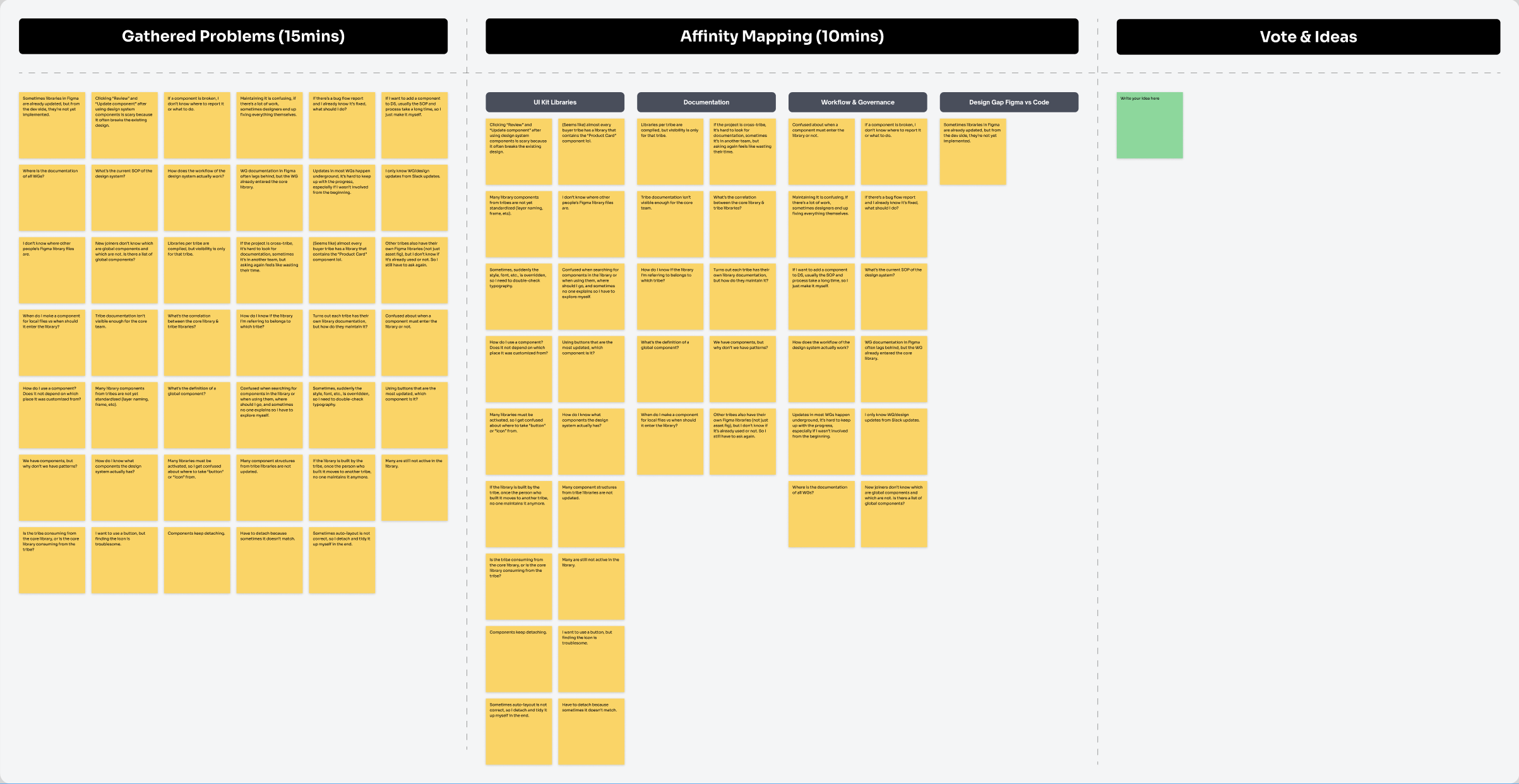
1. User research
Gather user problems by conducting user interview with designers and co-design sessions with Principal designers across tribes.
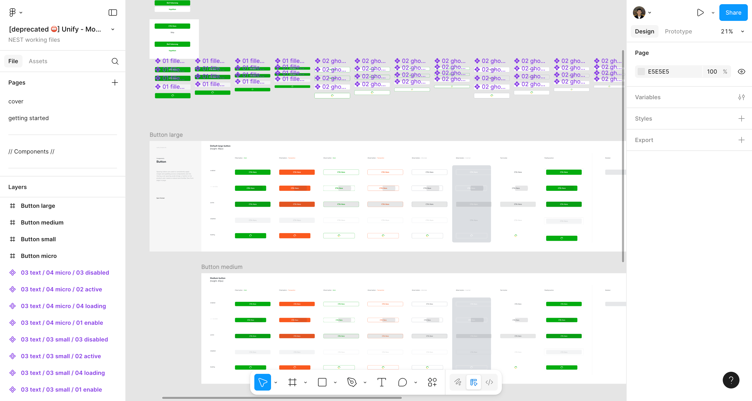
2. Design Internal Audit
Conduct design system audit reviewing design foundation, component libraries, documentation and gaps between Figma and Code.
Findings
Based on the insights, I’ve identified 4 core problems to address:


UI Kit Libraries
6 core libraries + 56 unknown libraries without clear standard and guidelines causing designer frustration.

Documentation
Not centralized and outdated documentation, with no standard documentation across the file.

Workflow & Governance
Unclear workflow and SOP in the internal design system causing designer breaking the rules to achieve their needs.

Design Gap Figma vs Code
Often the libraries in Figma are already updated, but from the code library side, they’re not yet implemented.
Part 2 - Design Strategy & Prioritization
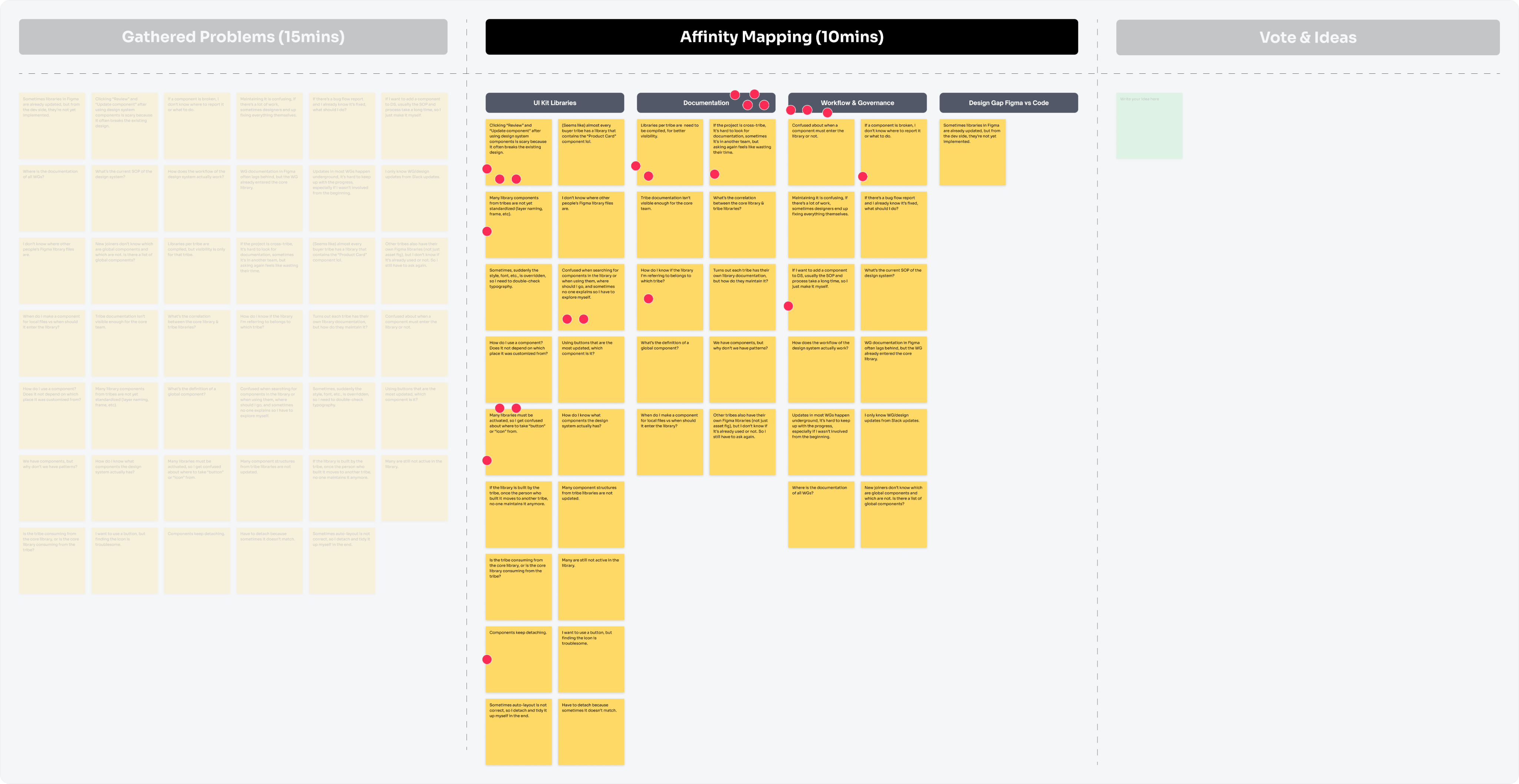
Based on voting and discussion, I focused on solving fundamental , high-impact problems:
- Standardizing libraries.
- Establishing governance and ownership.
- Create the component documentation.
Once the fundamental things are finished, I can continue to handoff the component specs to the front-end engineers. This will be our foundation for long-term governance.
Part 3 - Execution
This was a huge project, and to make it clear I plan to create separate case studies for each stream deliverable soon, stay tuned! 😉
Throughout the process, I collaborate with 8 principal designer s and split it into 2 groups: 4 focused on workflow, 4 on component documentation. As centralized team, by involving principals designers from tribe as product designers representation and thinking partner help me to communicate and smoothness the process. During this process here are the deliverables:
1. UI Kit Library
This is fixing the main issues such as component structure, layer naming, browsing experience, etc. I started by fixing the foundation library and core components , this was the most critical step to ensure all processes could run in parallel. Since Tokopedia is a mobile-first platform, I prioritized the mobile components first, followed by desktop and other libraries.
I documented the entire process as a case study, so it could be replicated with same standard. Given that Tokopedia had two types of libraries, Core and Tribe, I took full ownership of the Core library, while delegating Tribe libraries to their respective design teams as maintainers and with myself as the reviewer before they publish the library. This structure was supported by the workflow and governance I had prepared.
Nest Foundation Library
Nest Mobile Library
Nest Desktop Library
Nest Illustration Library
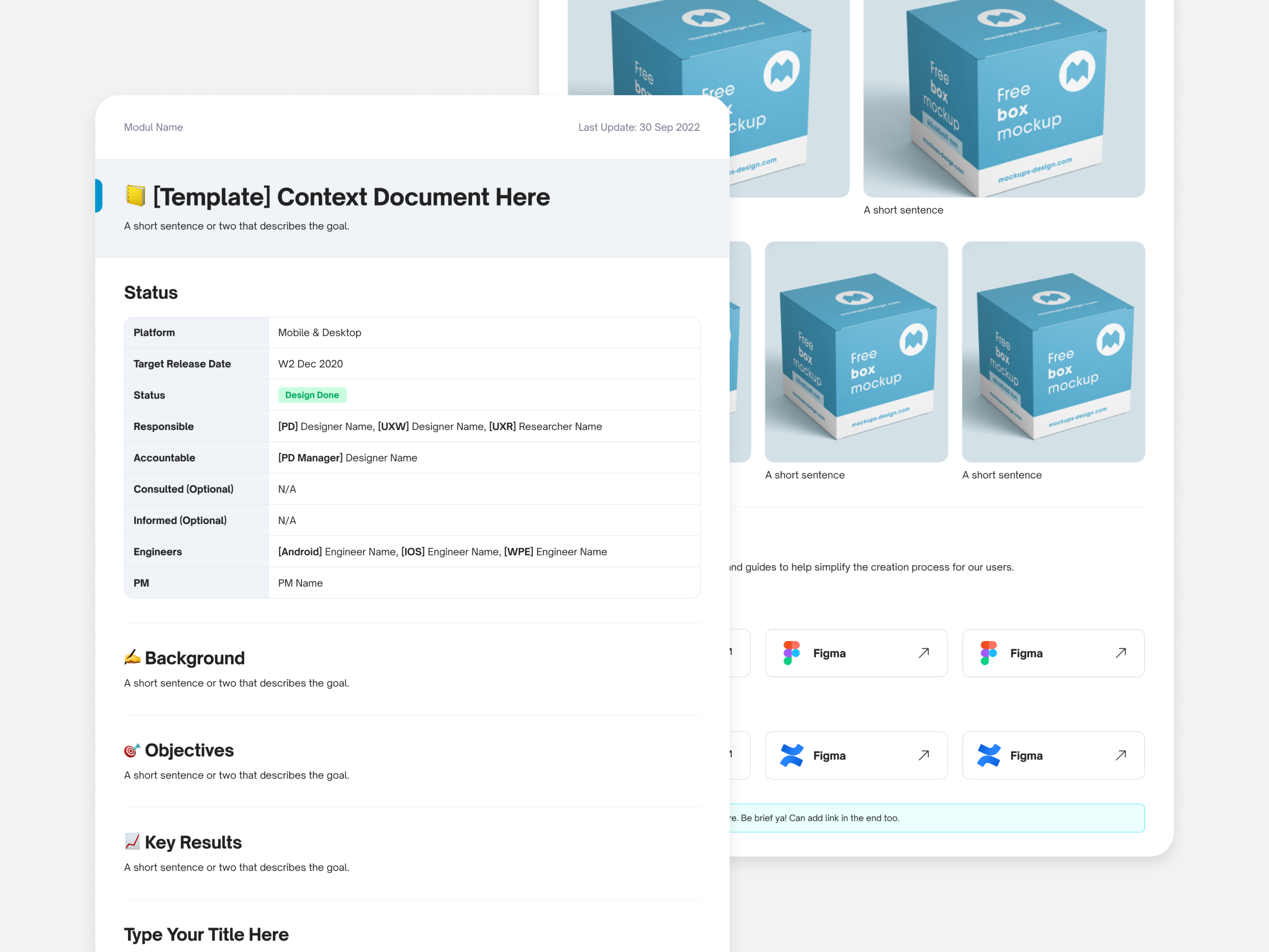
Nest Utilities Library
Buyer Experience Library
2. Documentation
There were two documentation challenges to solve: design system documentation and Figma project documentation . We’ve 40+ component mobile library same as desktop, tight timeline with only 2 people in the design system we could die haha 🤣
Therefore, to speed up the process, I collaborated with the Principal Designer to support component documentation for both mobile and desktop. This effort resulted in clear, reusable documentation and templates that streamlined future contributions.
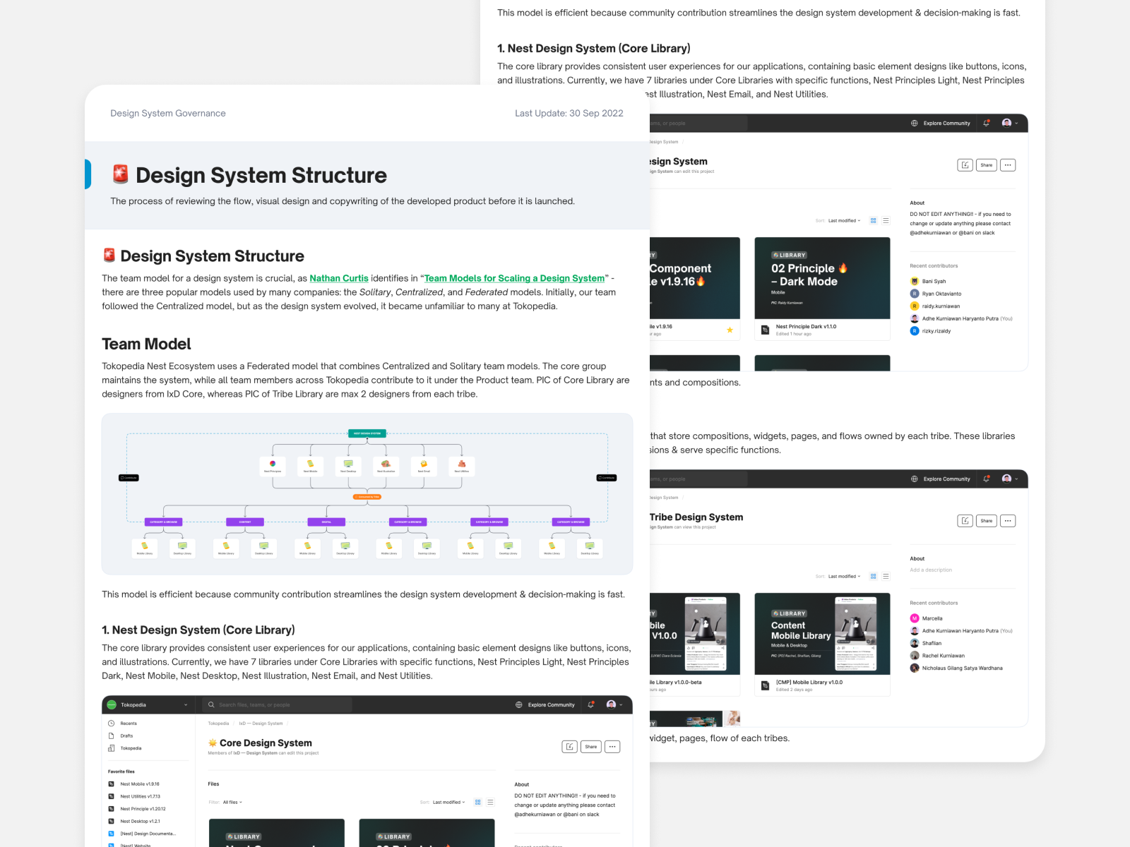
Design System Structure
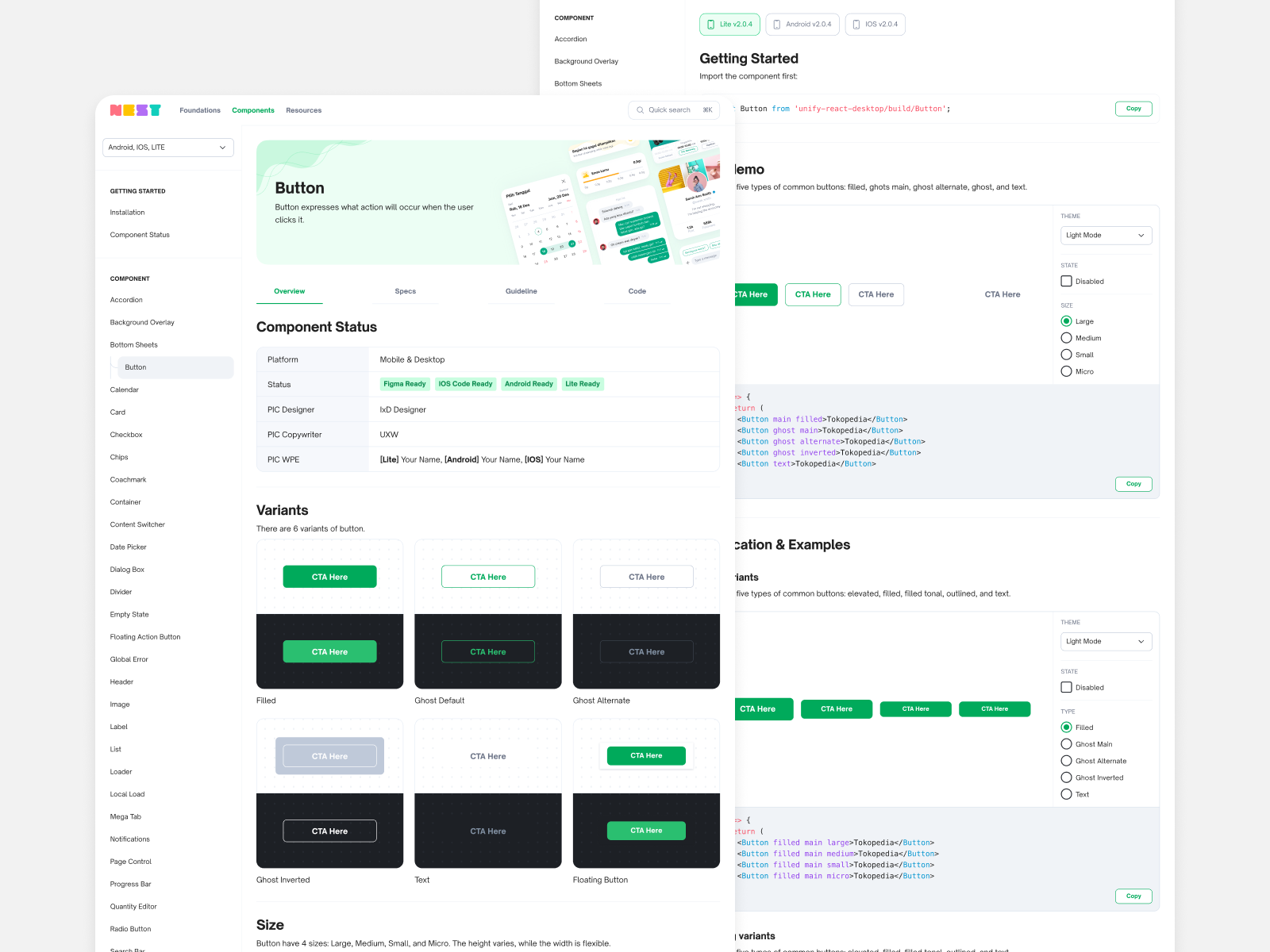
Design System Website
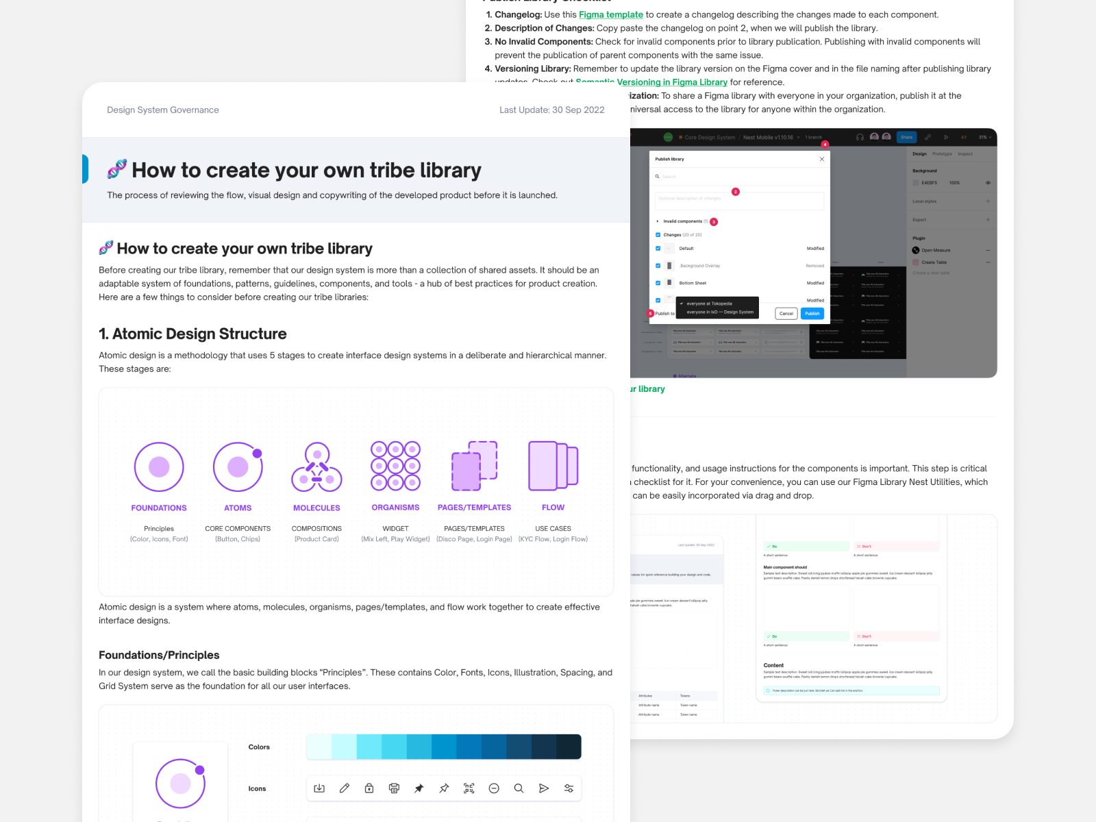
Component Creation Flow
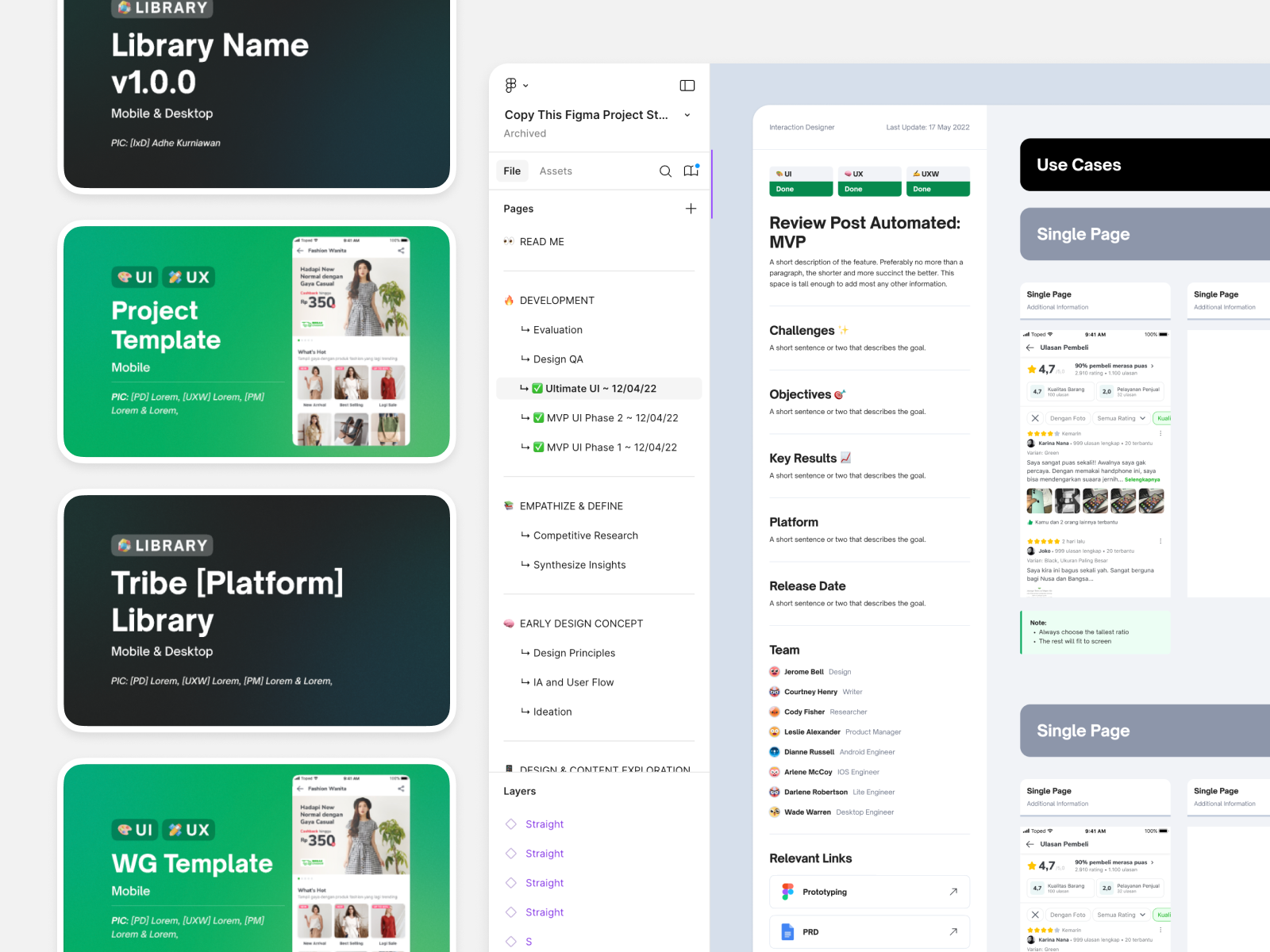
4 Working File Templates
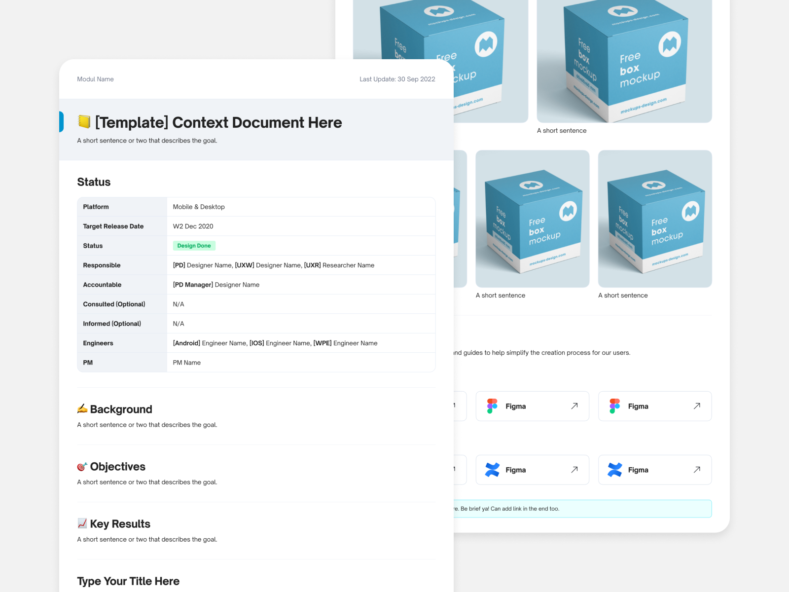
Figma Documentation
3. Workflow & Governance
This was divided into two projects: Internal design system workflow and Cross-functional workflow (Working Group) for adding, improving, or deleting Core/Tribe components.
I partnered with the Principal Designer to design the Working Group workflow, ensuring clarity and accountability across teams. The outputs became essential assets for maintaining long-term governance.
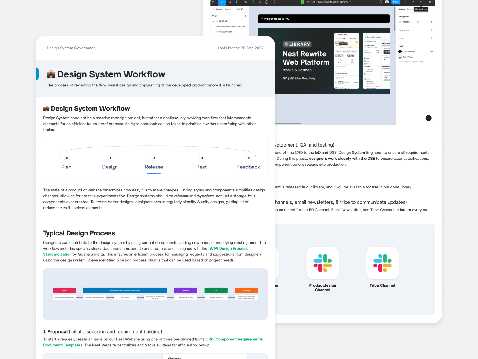
Design System Workflow
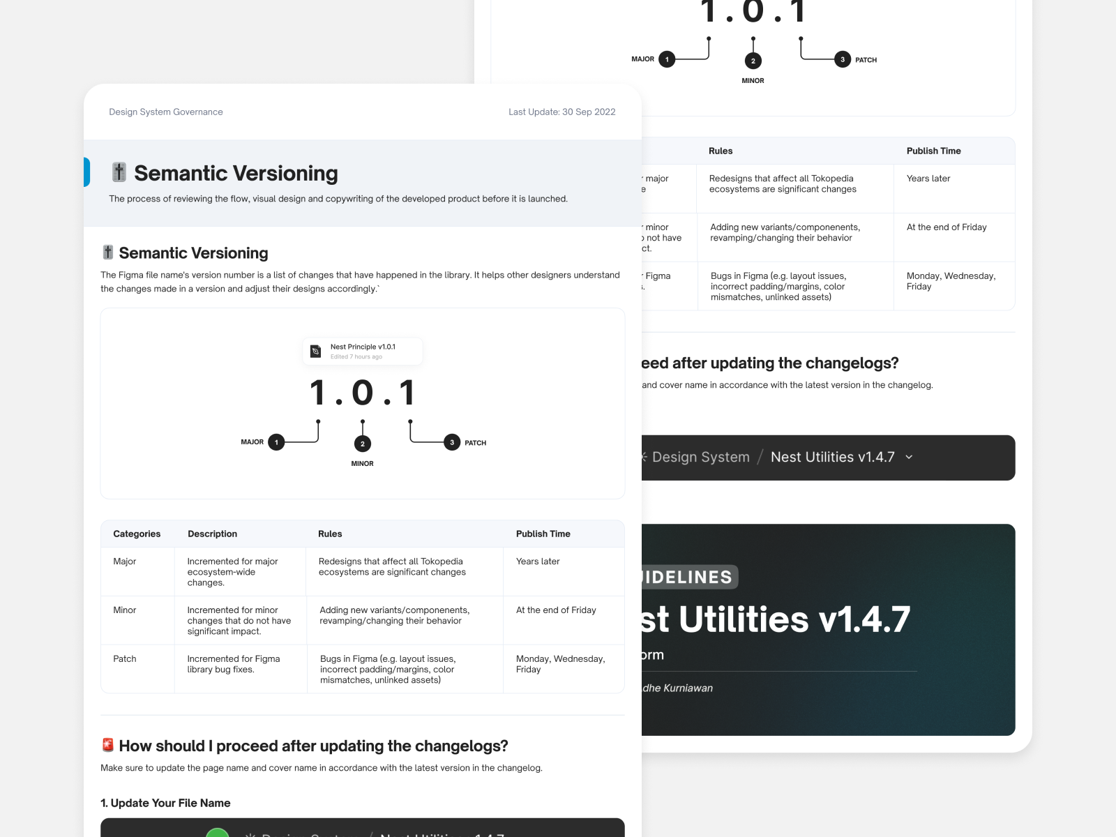
Maintenance Process
4. Design Gap Figma vs Code
Once the Figma components and documentation were finalized, I collaborated with front-end engineers to audit and align code with the updated design specifications . This collaboration improved scalability through refined tokens, improved component and accelerated workflows by making design-to-code boundaries clearer.
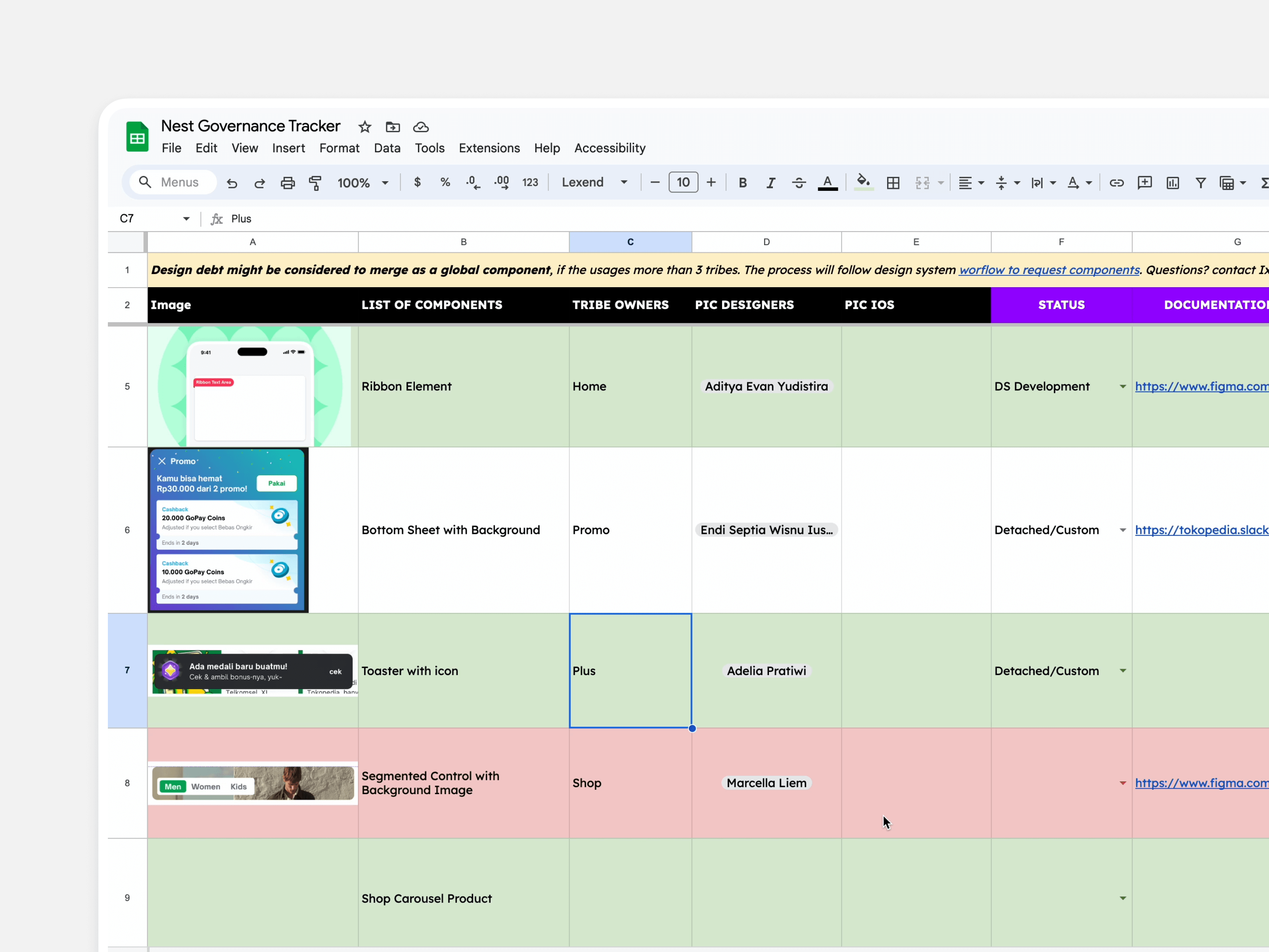
Design Debt
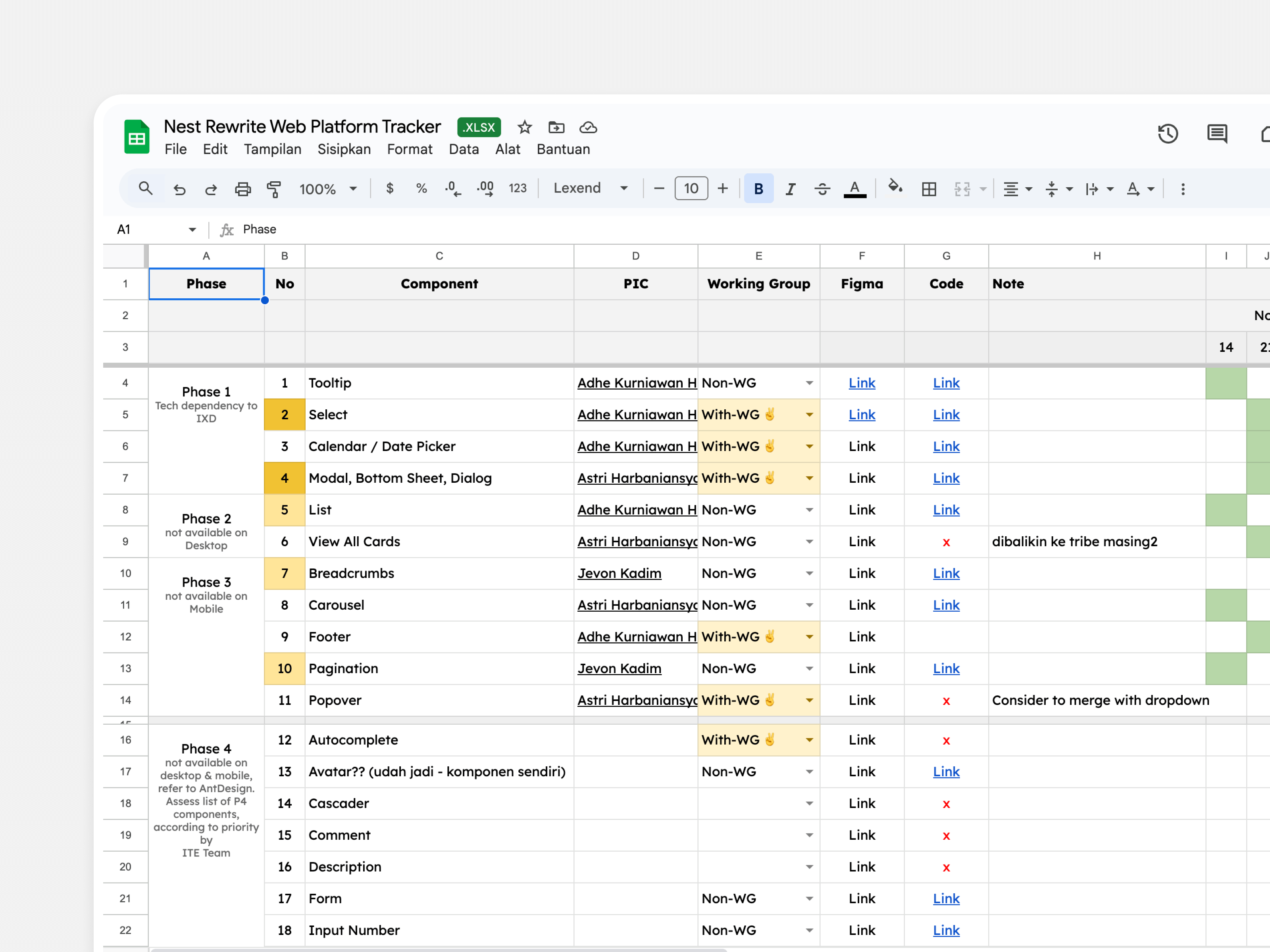
Rewrite Code
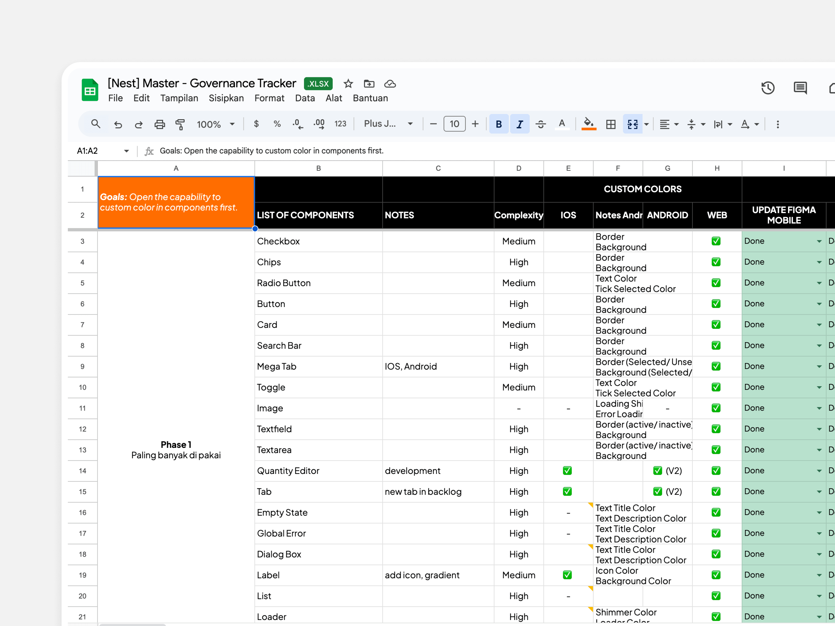
Component Customization
Reflection
This project was more than fixing a library. It was about rebuilding governance, trust, and scalability . By turning Nest into a governed ecosystem, we empowered teams to ship faster and more consistently, impacting millions of users.
It became even more valuable when Tokopedia was acquired by GoTo and TikTok Shop. The new governance make the collaboration process smooth, level up the designer deliverables, and standardize the design process. Leading this project taught me so much across different aspects through multi-team collaboration, and it became a strong foundation for my growth and for facing future challenges.