
My Contribution
I defined the new color palettes , led the design project to ensure implementation across devices, and collaborated closely with designers from tribe to create proof-of-concepts in their modules. Here are the results from our testing.

58.80%
CTR (Impressions)

49.95%
CVR (by Clicks)

1x
Viral on Twitter
ABOUT THIS PROJECT
YEAR
2023
TIMELINE
6 MONTHS
ROLE
SR. INTERACTION DESIGNER
CONTRIBUTORS
UX ENGINEERS, UX DESIGNERS, UX WRITER, DATA ANALYSIS
Context
GoTo Group, the largest digital ecosystem in Indonesia. With the introduction of these color vision impairment-friendly features, unveiled ahead of International Day of Persons with Disabilities, GoTo Group is realizing its commitment to providing an inclusive digital ecosystem for application users at large, as part of the Company's Three Zeros Sustainability Commitment.
Color blindness is the inability to perceive differences between some of the colors that non-colored impaired users can distinguish. According to Color Blind Awareness , color blindness affects approximately 1 in 12 men (8%) and 1 in 200 women (0.5%) .
Our average monthly visitors in 2021 based on Katadata is 149.6 million monthly visitors. If we compare to the color blind percentage, that translates to approximately 12.7 million people.
The most common color blind is Red-Green (Deuteranomaly) color blindness and the fact is our company color is green. It means a lot of people are affected by the color. We use a lot of green to determine the main action item. It applied generously throughout our entire UI, most commonly on the CTA button. If we take out the color factor, we can assume that the users are forced to use text or icon to interpret the meaning.
With all the facts, we feel the need to make all people who suffer from color blindness feel included and comfortable while using our app.
Problem
During our assessment we phase a several problems:
- Existing Tokopedia colors lacked sufficient contrast for color-blind users.
- Users with Deuteranopia and Protanopia couldn’t reliably perceive green CTAs, which green is our brand color.
- Tokopedia was simultaneously migrating design system tokens , requiring mapping across both old (Unify) and new tokens (Nest).
Simulation - Normal, Deuteranopia/Protanopia and Tritanopia
Objectives
As a member of the GoTo Group, Tokopedia is committed to creating an inclusive digital platform. To ensure that our website and apps are accessible to all users , we are developing a color-blind theme as an accessibility feature. This will enable users to easily choose and switch to a theme designed specifically for color blindness, enhancing their overall experience. The new theme will integrate smoothly into the user interface using the Nest color token in website, web-view, ios and android.
Design Process
Start in Mid Q1 2023, this project unveiled ahead of International Day of Persons with Disabilities on December 3rd. This process will include a me as a design system designer, Product Designer from the tribe, UX writer, and UX engineers.

1
Research
2
Design
3
Build & Test
4
Launch
Part 1 - Research
Color blindness is a new concept for me and the team, so I need to gain a better understanding of user behavior, how they perceive colors and how to treat the users.
1. Understanding Color Blindness
Based on my research, there are several approaches we can take. However, in the context of product design, here are a few methods we can implement:
Choose the Right Color
There are 3 major types of color blindness, and knowing the science behind them can help you when thinking about designing for color blindness:
- Red Green , in which a person has difficulty distinguishing the color red from the color green, is the most common type, and there are 4 types of red-green color vision deficiency.
- Blue-yellow, the less common type of color vision deficiency, blue-yellow color blindness makes it difficult to tell blue from green and yellow from red, and there are 2 types of blue-yellow color vision deficiency.
- Complete color blindness, also called monochromacy/achromatopsia, total color blindness is quite rare , affecting about 1 in 33,000 people (vs. about 1 in 12 men for color vision deficiency in general).
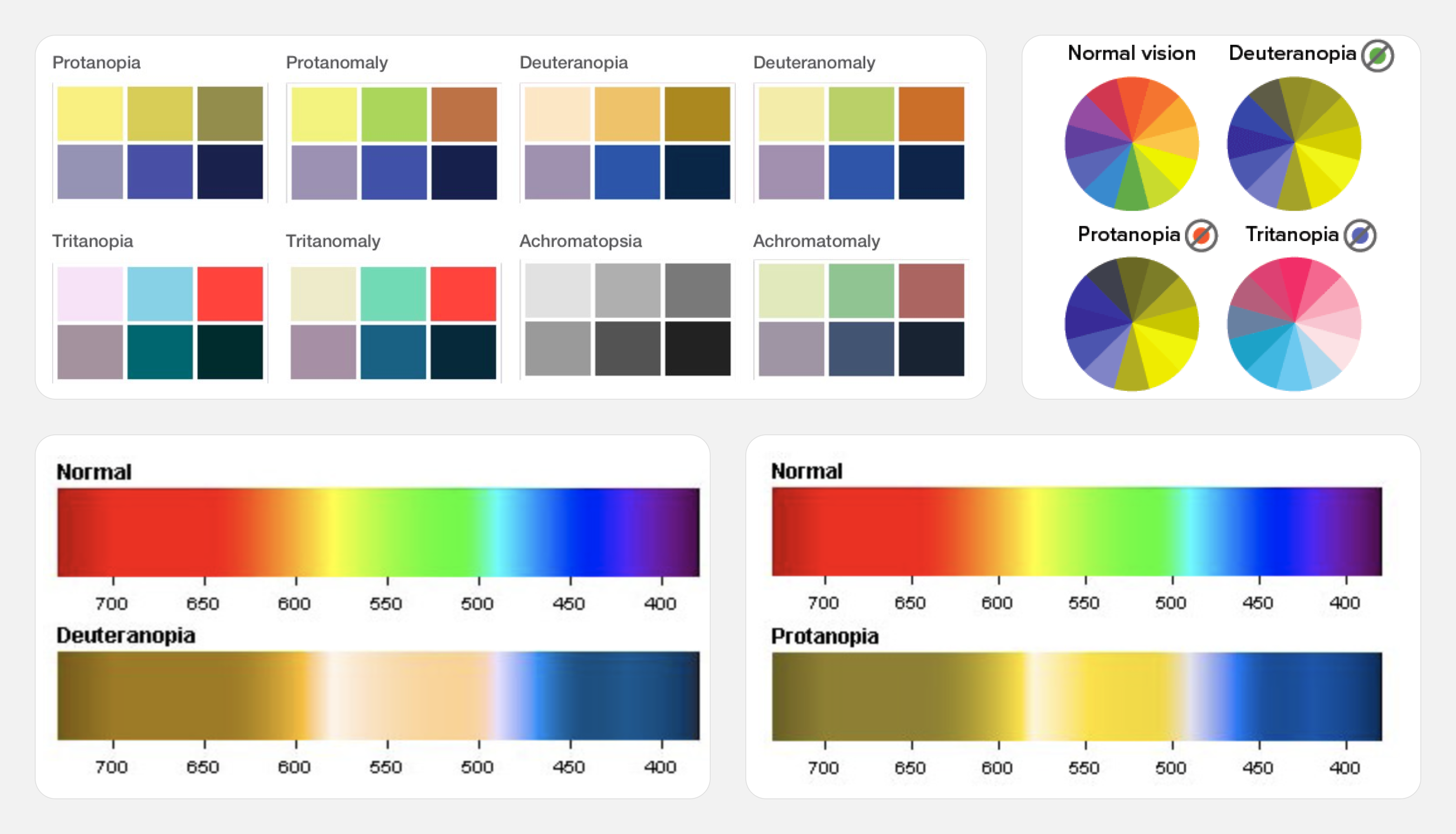
Color vision deficiency
Use the Right Symbol and Keep it Simple
When designing for color blindness, avoid relying only on color to convey information. Instead, use multiple techniques to capture users' attention effectively , such as incorporating essential icons and maintaining a simple design. Even if a color is green, the right approach can enhance accessibility for those with color blindness.
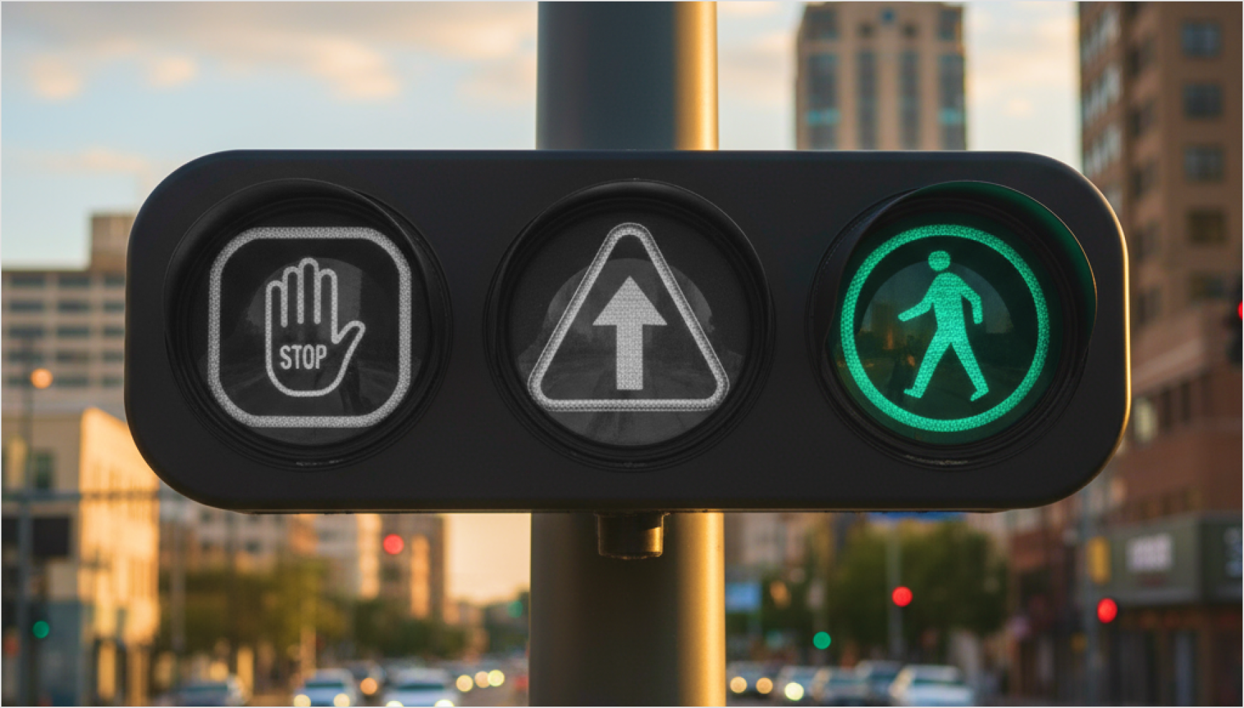
Traffic light with icon
2. Competitive Research
Benchmarked on Apple, Google, Slack and Asana, which offer custom modes for Tritanopia and Deuteranopia/Protanopia.
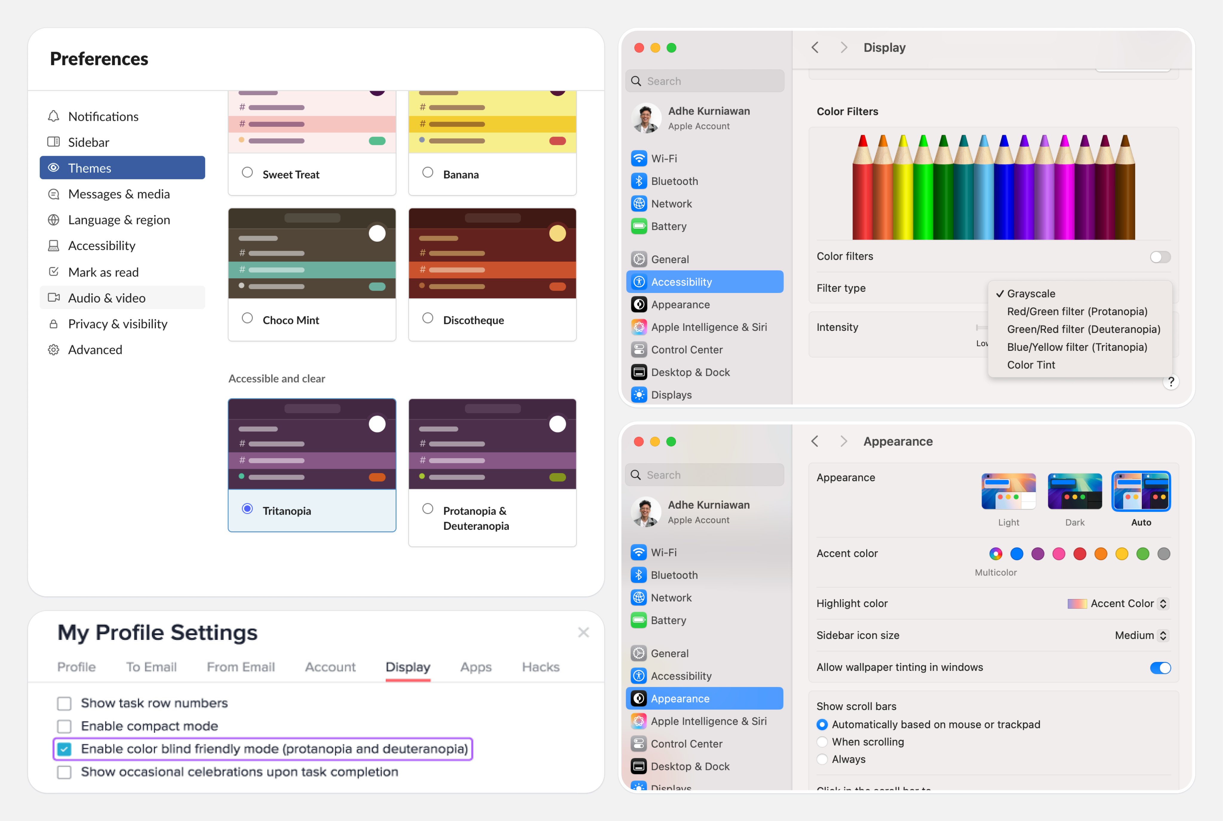
Apple, Slack and Asana provide Tritanopia and Protanopia & Deuteranopia
Findings 🌟
The primary focus in addressing color blindness is selecting the right colors with appropriate contrast and lighting. Research indicates that:
- Colorblind Mode is essential for visual accessibility, allowing platforms to cater needs of colorblind individuals and create an inclusive experience .
- Focus on providing the 2 modes: Deuteranopia/Protanopia and Tritanopia .
- Most platforms provide a preview of the appearance or colors for each Colorblind Mode option, also incorporate icons in the interface which helps users quickly and accurately understand the differences and changes.
- Additionally, all platforms distinguish between Dark Mode and Colorblind Mode , as they serve different purposes.
Part 2 - Design
This part will focus on how I define the color, until publish the color.
1. Convert Color
To streamline the process, I utilized several tools to convert Nest colors into color-blind friendly shades. Here’s a view in three different color modes.
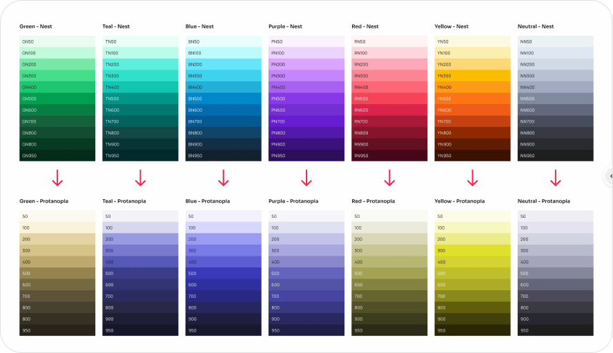
Nest color to Protanopia/Deuteranopia and Tritanopia
2. Color Mapping
The next step is to map and eliminate unnecessary Nest colors for individuals with color blindness. Since Deuteranopia and Protanopia share similarities, we will combine them. This results in a color palette for color blindness with three combinations: Deuteranopia/Protanopia (Blue, Yellow, and Neutral) and Tritanopia (Teal, Red, and Neutral).
Nest to Deuteranopia/Protanopia
Green serves as our main action color , which then transitions to Yellow. However, since Yellow indicates a warning message, I've reassigned Green to Blue.
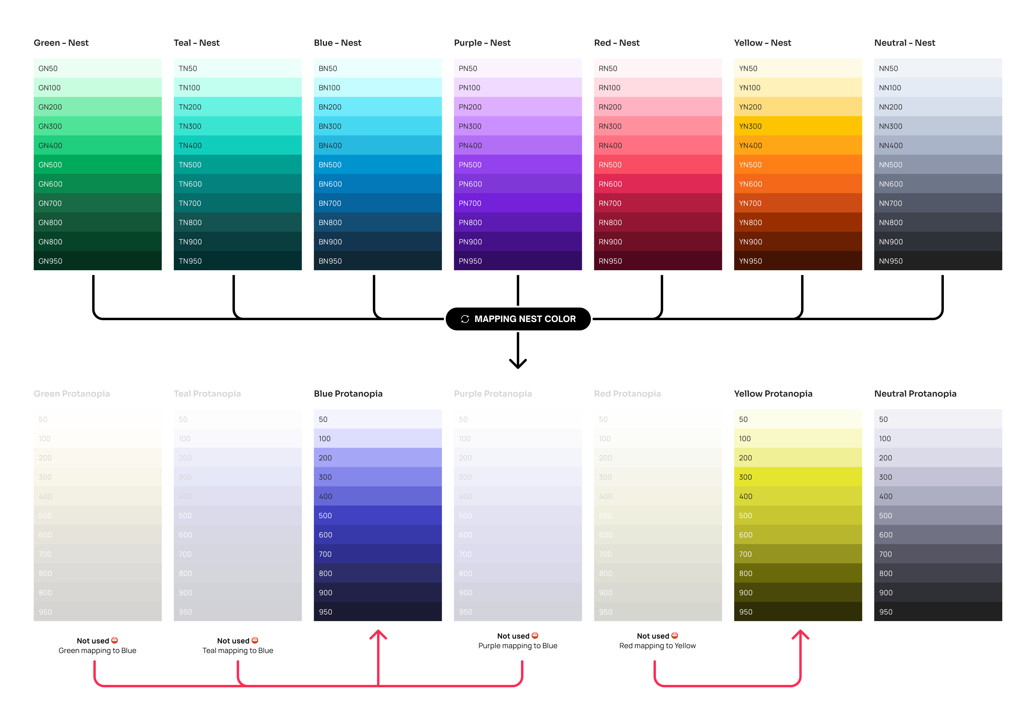
Nest color to Protanopia
Nest to Tritanopia
Purple is our branding color for the Official Store , by default it’s transitioned to Neutral. But, it’s blend with the neutral, to emphasize and highlight the exclusivity of the Official Store, I've remapping Purple to Red. Also considering, red is rarely used except for error only.
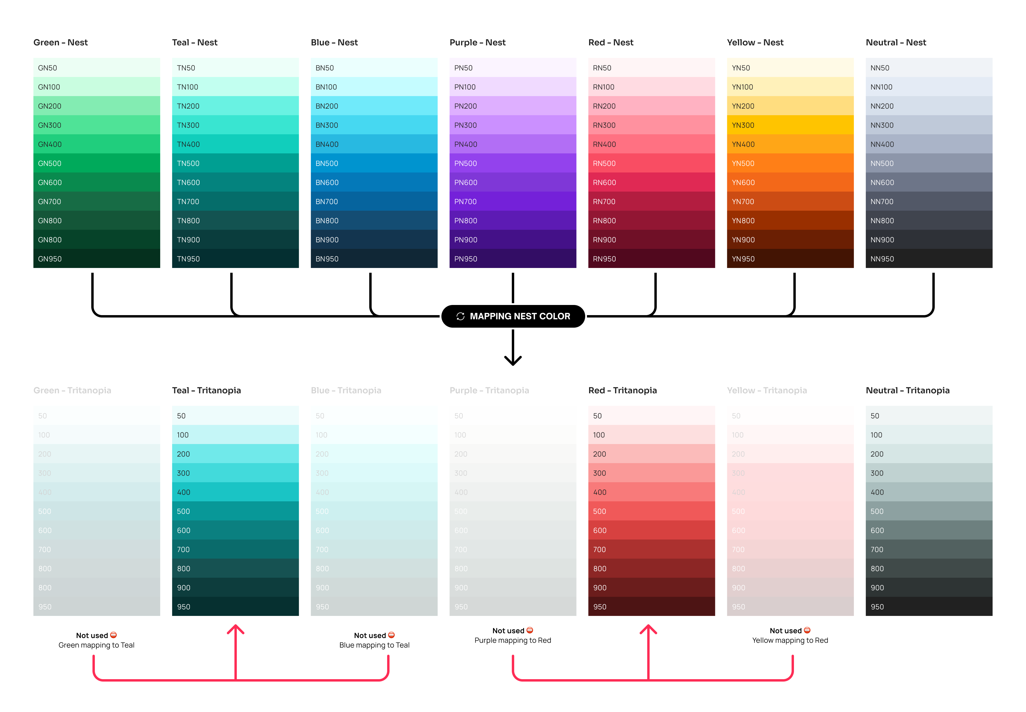
Nest color to Protanopia
Unify to Color Blind
While we’re still migrating design system tokens, I need to map both the old and new tokens . Currently, many services are still using the old system, and the total number of old tokens and the name are differs from the new ones. Therefore, I need to create a mapping for the old colors.
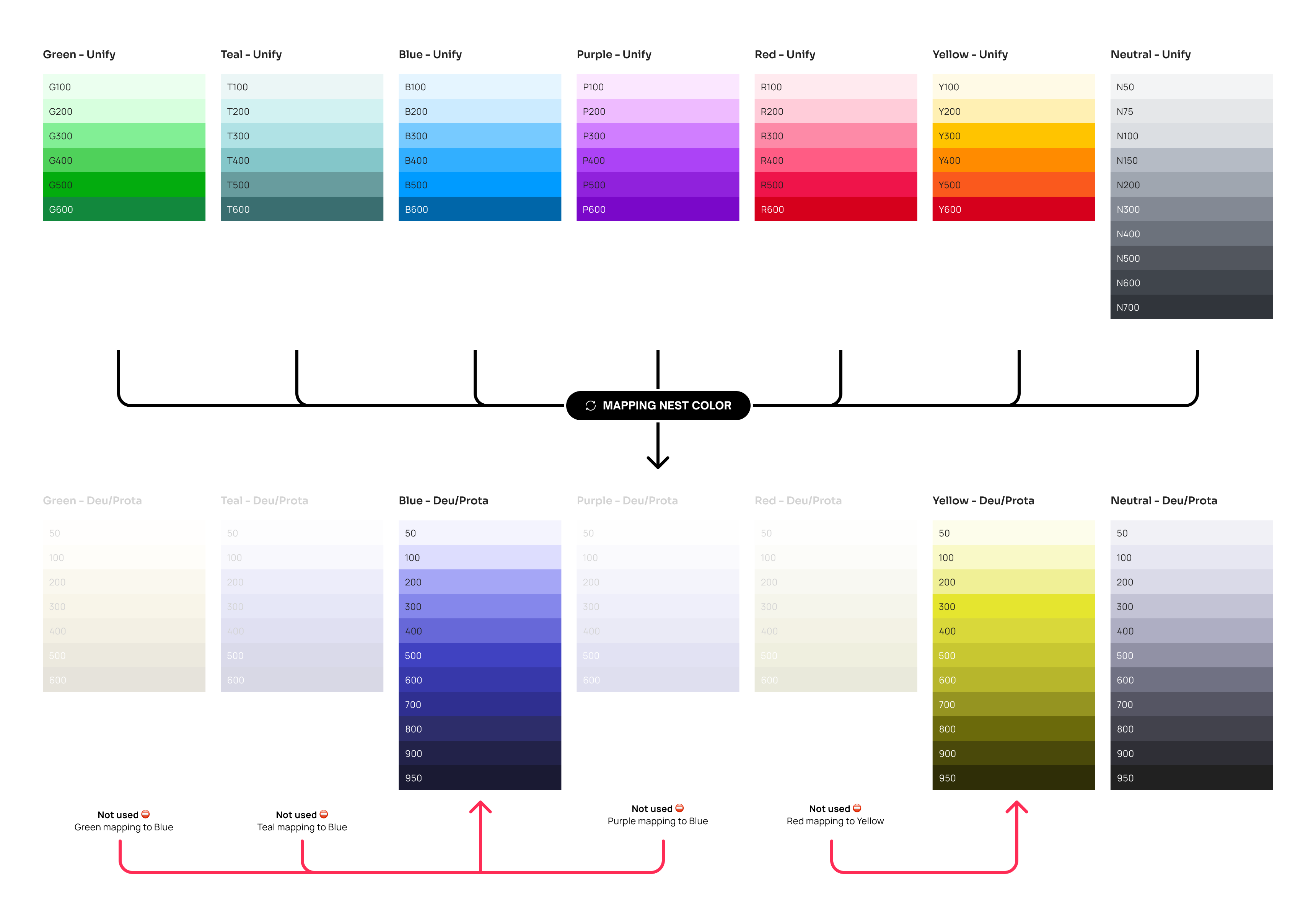
Nest color to Protanopia
3. Color Adjustment
Increase the contrast to accommodate color-blind users more effectively. This will be the definitive color chosen for our design system.
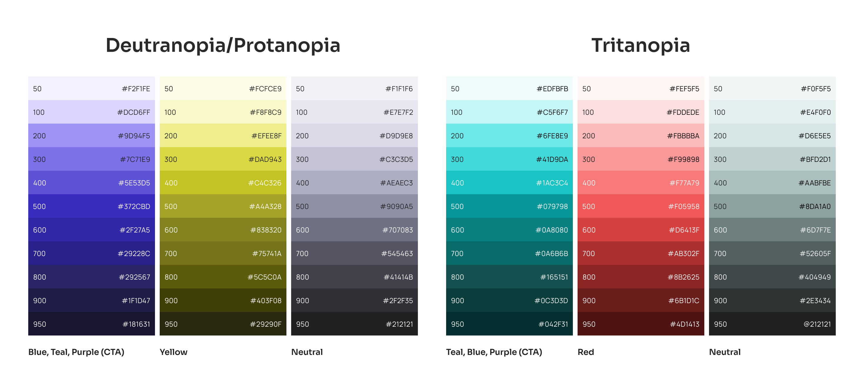
The final colors we used were for Nest (new token) and Unify (old token).
4. Update Design Token & Publish
We’re using multilevel design tokens, so I only need to update the base color tokens in Nest on Figma, I also collaborated with the UX engineers to refresh the design tokens in the code. This process ensures that the design and code implementation are aligned.
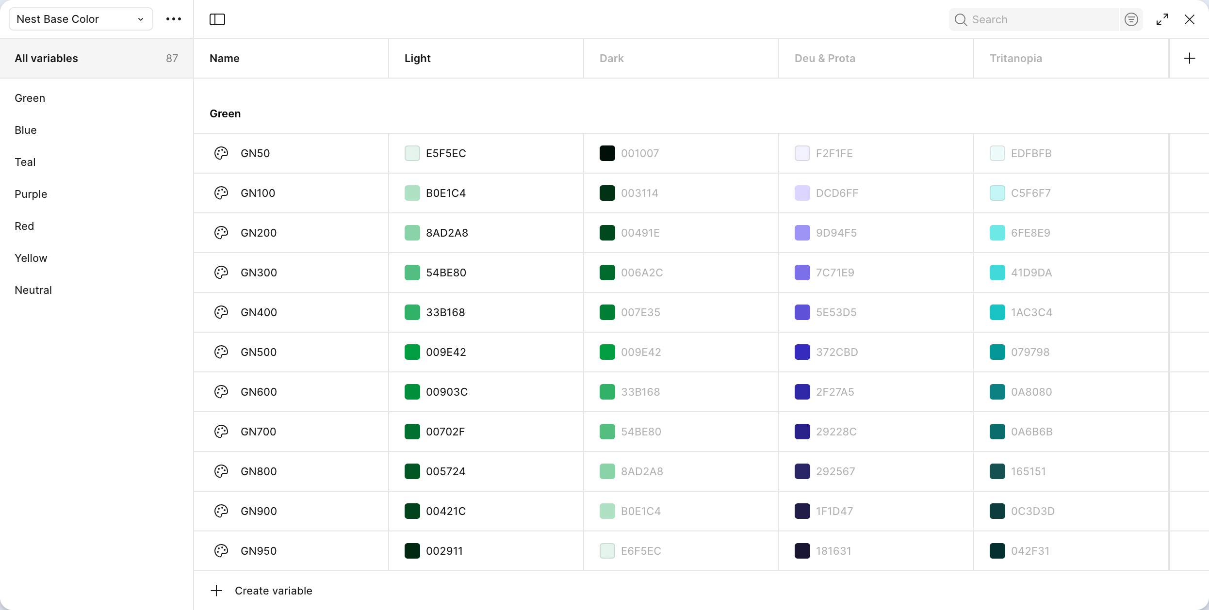
Update base color tokens in Nest Foundations
Part 3 - Build & Test
The design tokens are set for use, and I’m working closely with the Frontend team, UX designers, UX Writer and Data Analysts to conduct a proof of concept . This will help us test the color choices and gather user feedback.
Our notification center is a dynamic feature that showcases text, icons, links, and images. The frontend team also owned this notification module. Therefore, we have established this module to streamline the POC process.
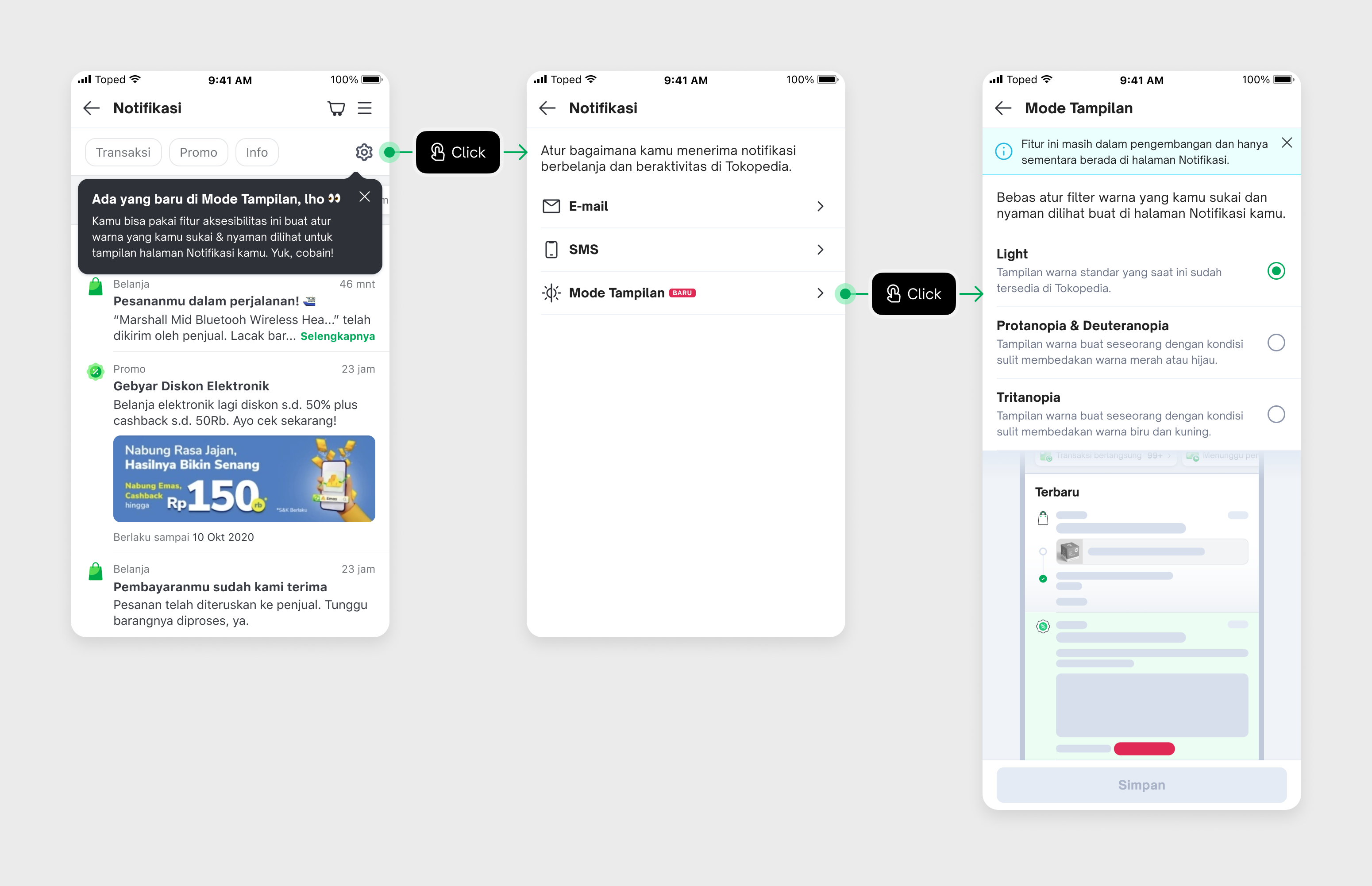
Example design concept by designers
Result
During testing, we achieved a 58.80% click-through rate (CTR) from impressions and a 49.95% conversion rate (CVR) from clicks. Additionally, the project went viral on Twitter , sparking positive public discussions about accessibility. We also received approval from the DA to roll this out to all users. 🎉
Part 4 - Launch
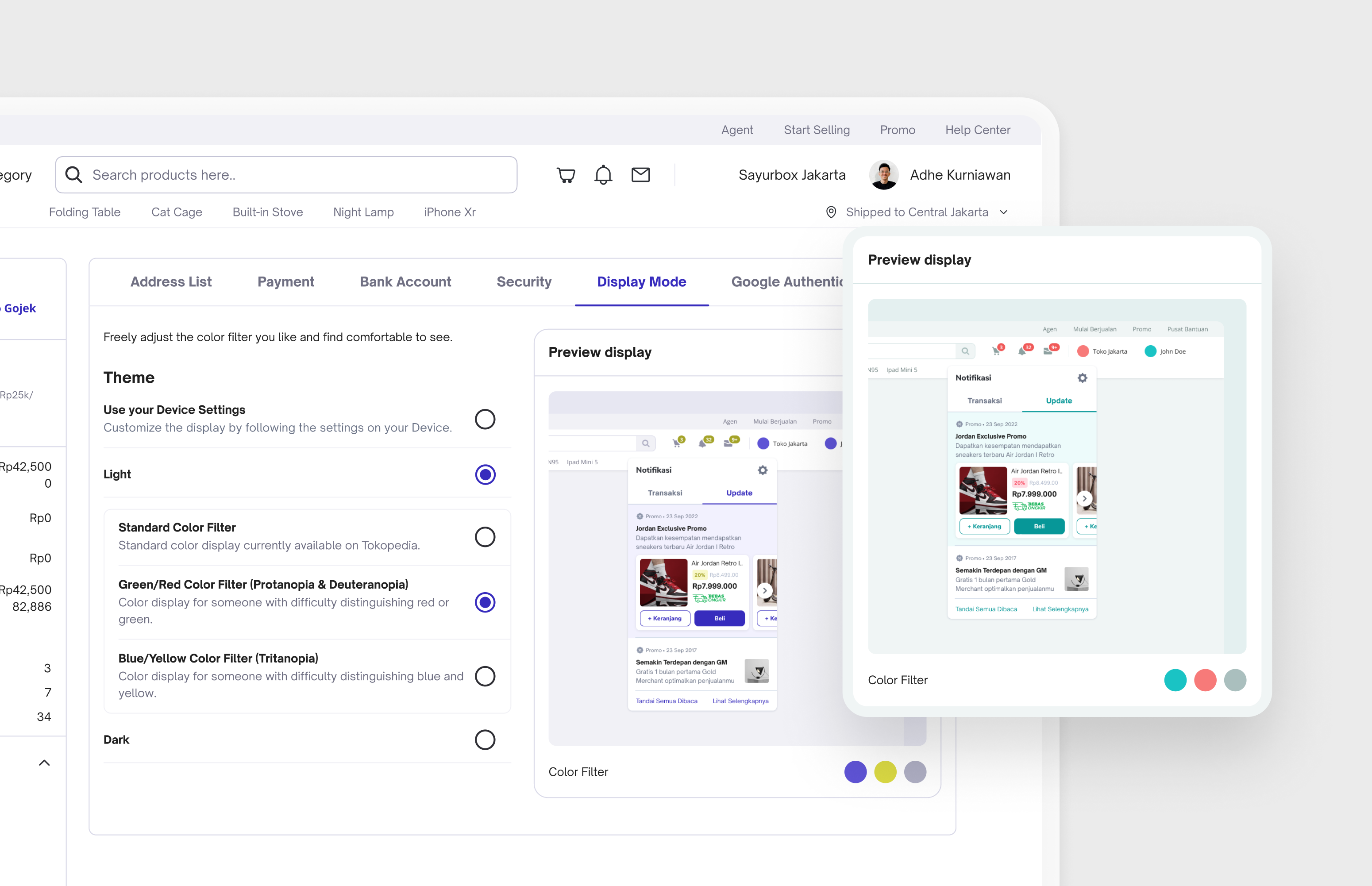
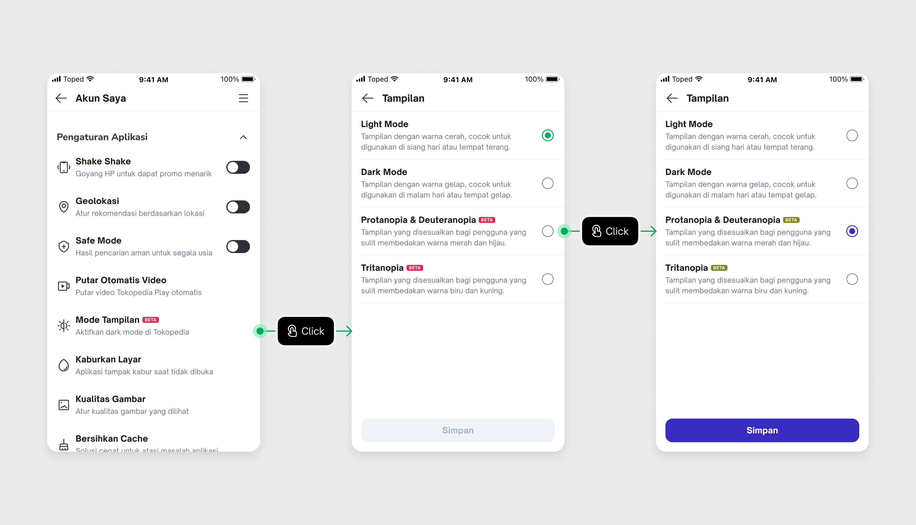
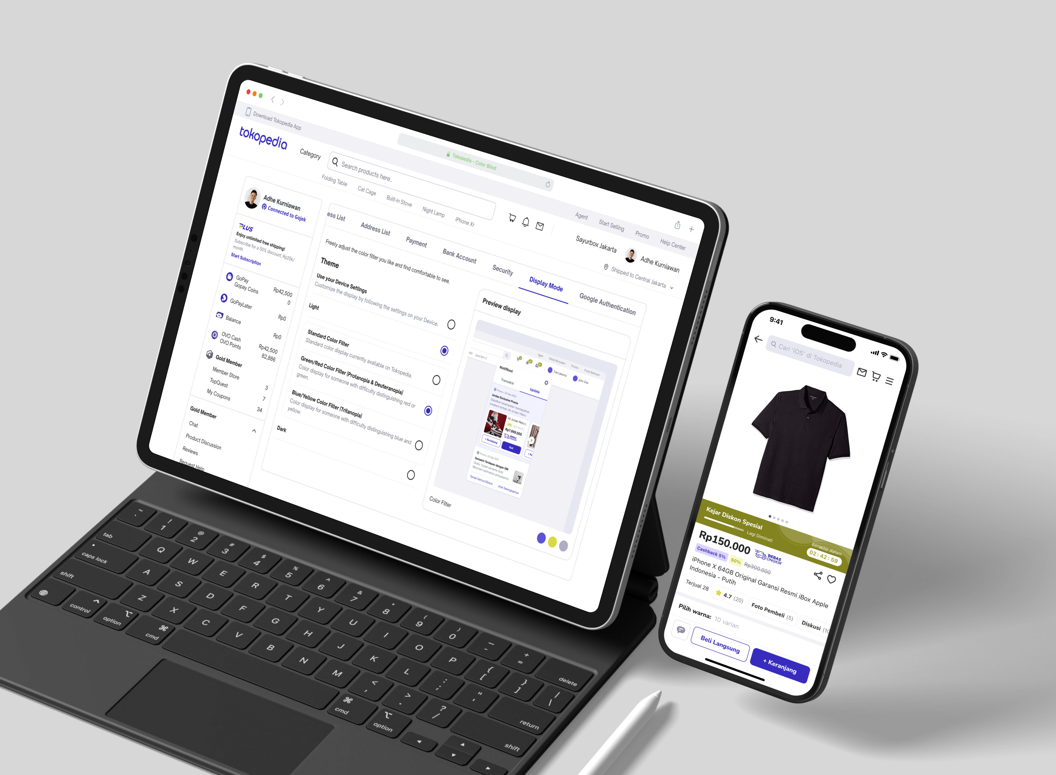
We have a solid foundation to roll out the new feature. I collaborate with another designer to establish a permanent entry point in both the desktop and mobile apps.
This feature was officially launched on December 3rd 2023 to commemorate the International Day of Persons with Disabilities. Here’s our design tailored for color blindness.
Reflection
Kudos to everyone involved in making this project a happens! 🎉 🎉
This project wasn’t only about updating colors, it was about mainstreaming accessibility into Tokopedia’s product DNA. By prioritizing inclusivity, we:
- Improved usability for millions of users with color vision deficiency.
- Elevated Tokopedia’s role as a pioneer in digital inclusivity in Indonesia.
- Built scalable governance by embedding accessibility into Nest tokens.
Personally, this initiative strengthened my skills in cross-team collaboration, accessibility research, and system-level implementation. It reinforced my belief that accessibility isn’t an add-on, but a core product responsibility.